LaunchDS


Tokenized Design at Scale. Built for Figma Sites.
Stop Designing from Scratch. Start Launching. With a Fully Tokenized Design System based on a 3-layer Architecture that Decouples Logic from Styling. Inclding Ready-Made Sections for Figma Sites.

There is no single right way to build a Design System. This is a curated collection from my professional experience—stripped down to the essentials to avoid clutter. It’s a work in progress—just like any good product.


Name of the Person
Relevant Description
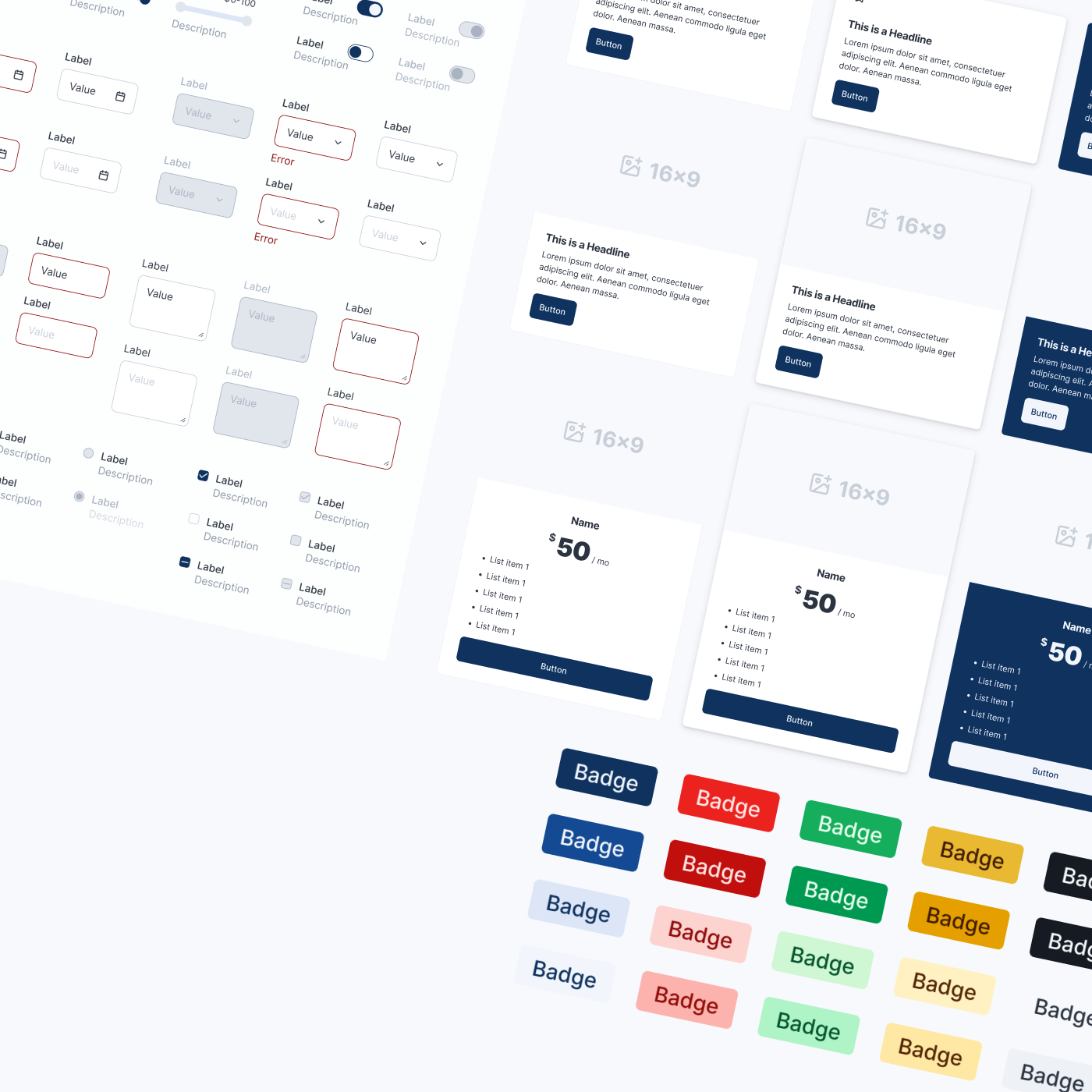
100+ Components
Essentials for Your Vision
Skip the setup, own the design. LaunchDS provides the essential Component Library with Buttons, Inputs, Menus and many more. The workhorse of your UI, to get you moving fast.
Multi-...Brand ...Theme...Device
Skip the setup, own the design. We provide the essential architecture and sections to get you moving fast. It’s not a rigid template—it’s a flexible core system waiting for your token decisions to define the brand.
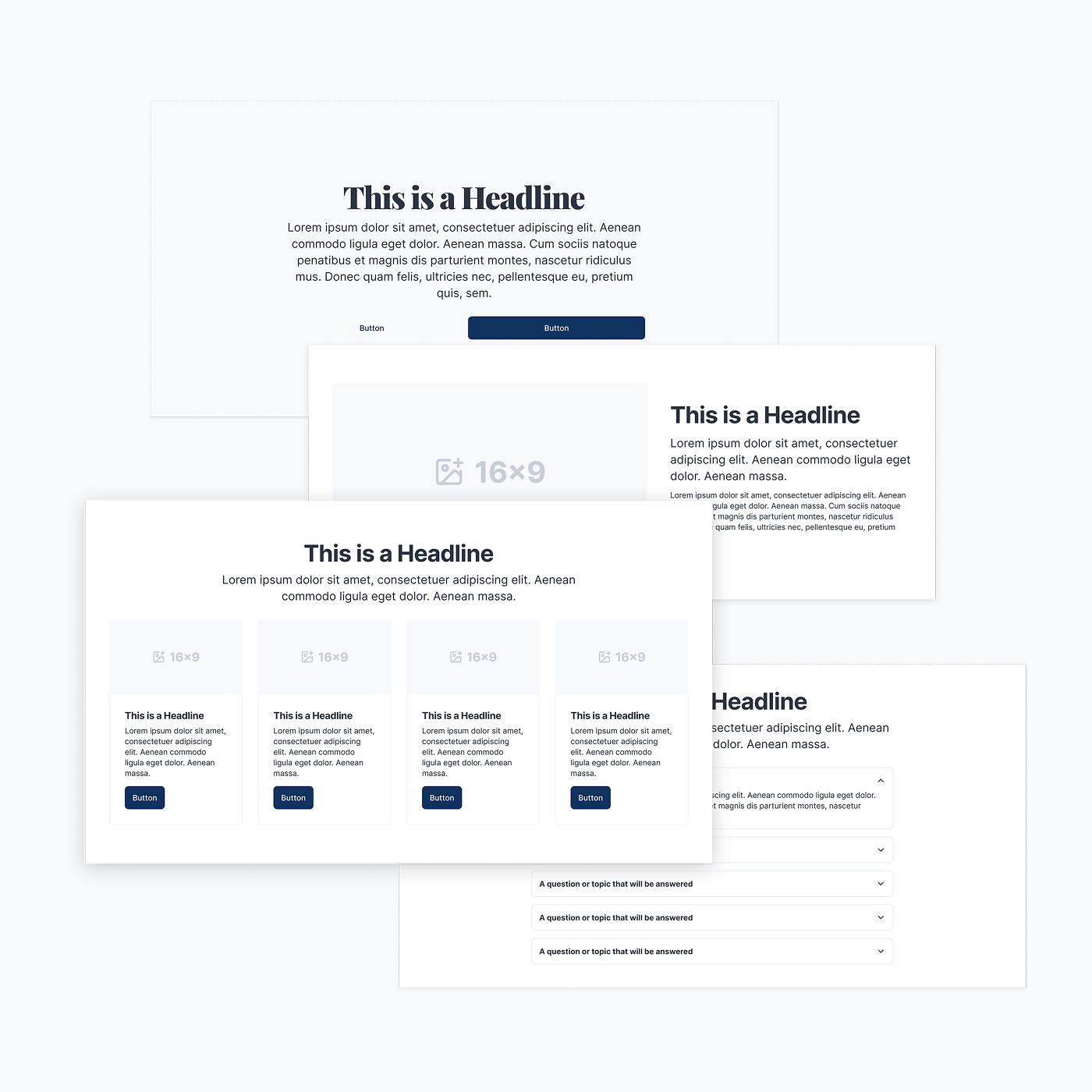
Build a stunning Website in minutes
We’ve combined components into customizable, production-ready website sections: Hero Sections, Teaser Cards, FAQ Modules, Headers & Footers. Just include the Library in Figma Sites.
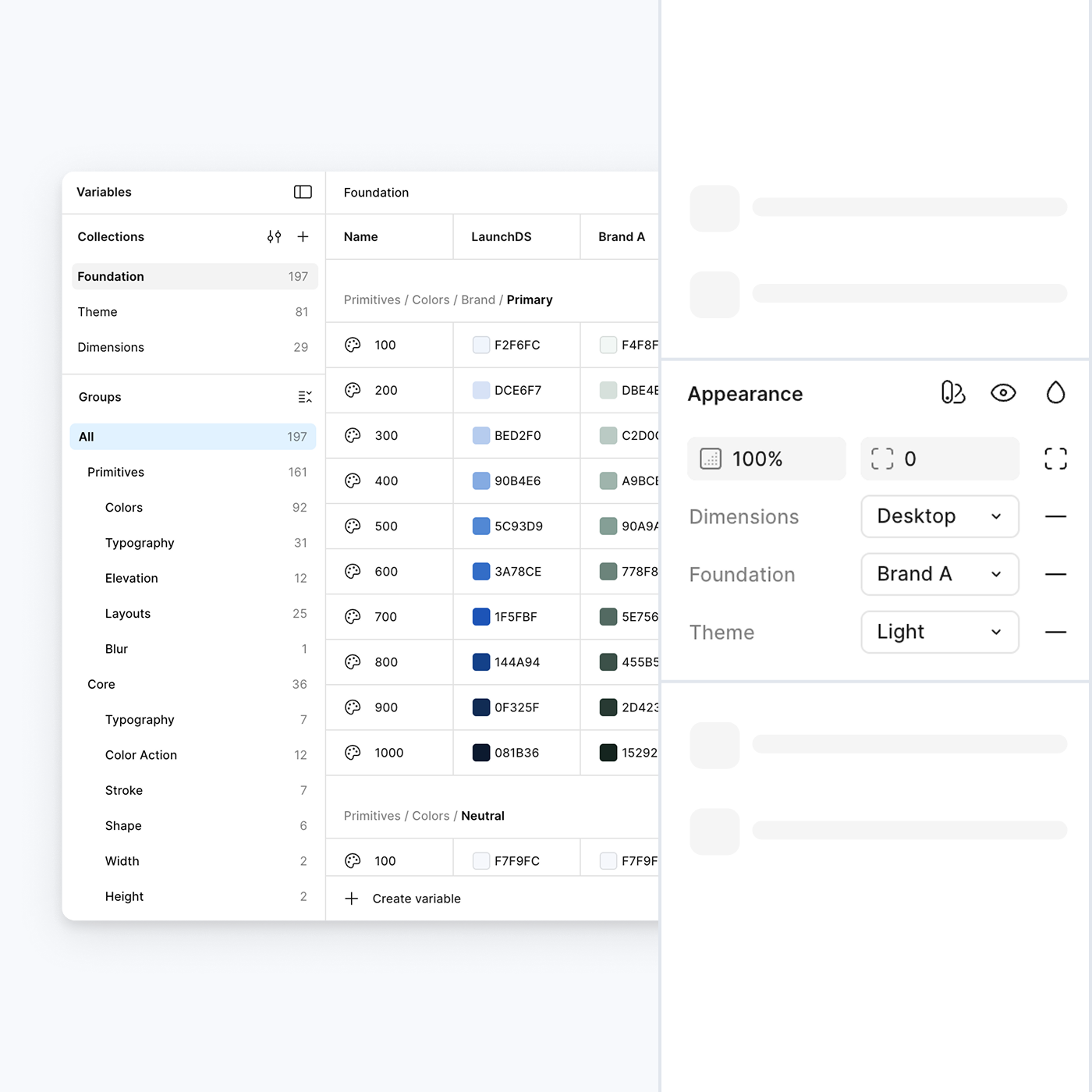
Token Architecture
This is the nerd part. We don't use hardcoded values. Every component is built on Core, Theme, and Dimension tokens that alias the raw Primitives directly.
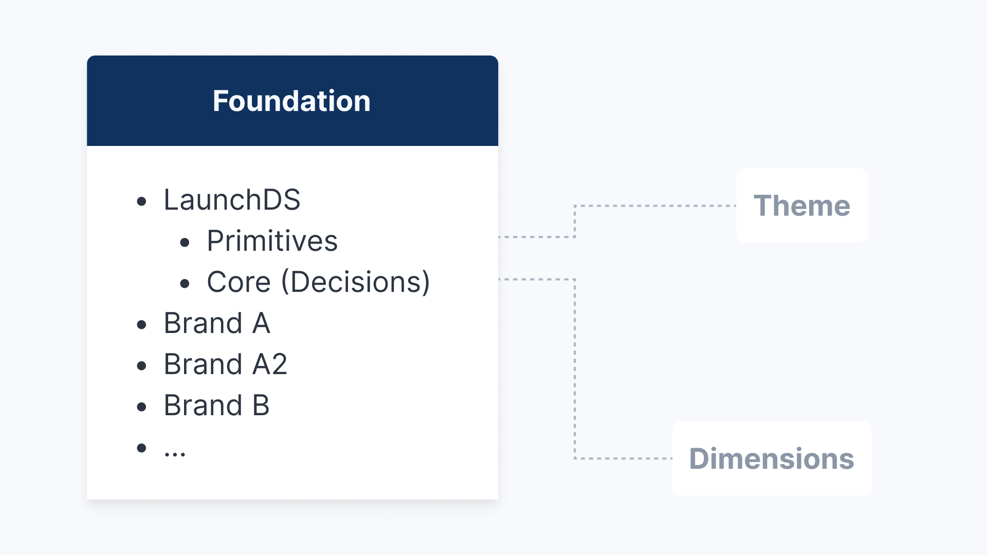
Foundation
Primitives are the raw material. Core is the decision. We separate raw values (Global Scope) from semantic logic (Brand Scope). This allows you to completely rebrand the interface by simply swapping the Primitives, without touching the Core architecture.
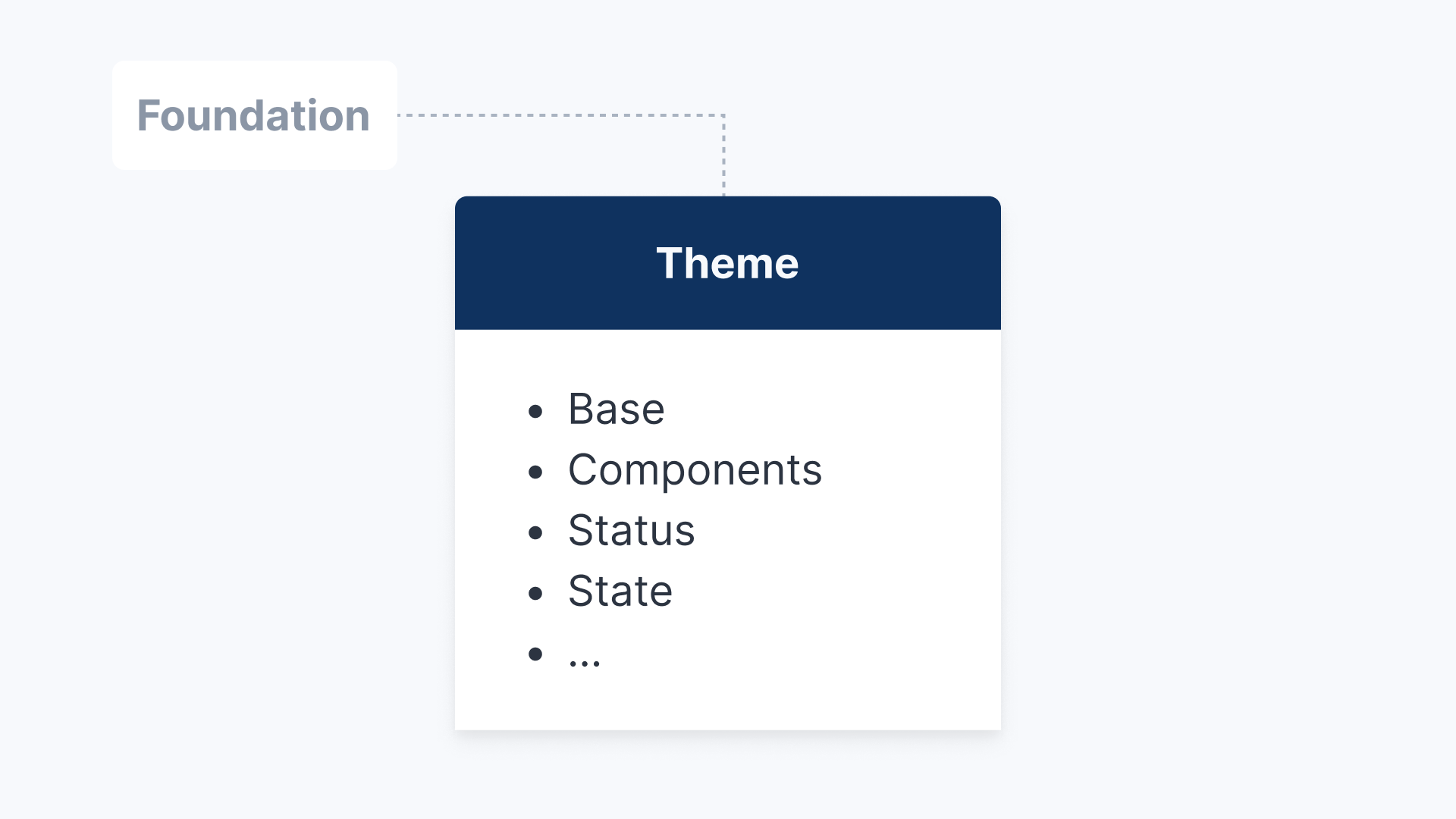
Theme
Theme is the Lighting. The semantic layer that adapts your UI to the user's environment. It maps functional roles like Surface and Content to colors, enabling automatic switching between Light and Dark modes without changing the structure.
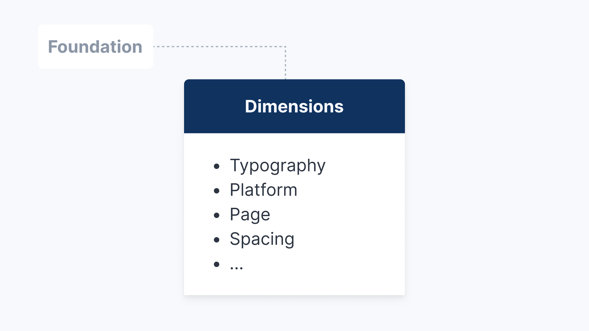
Dimensions
The responsive layer (physics) that adapts spacing, typography, and touch targets to the viewport. It allows the interface to "breathe" – expanding for mouse interaction on desktop and condensing for touch on mobile.
Features

100% Tokenized
Every color, radius, and spacer is a variable. No hardcoded values, just pure logic.

3-Layer Architecture
Decoupled logic for maximum scale: Foundation (Brand), Theme (Context), and Dimensions (Device).

Intelligent Breakpoints
Fluid scaling built-in. Components adapt automatically from Mobile to Tablet to Desktop using Dimension tokens.

Semantic Theming
Built with semantic roles (surface, content, action). Switch to Dark Mode instantly without touching a single layer.

Production-Ready Sections
Includes a library of 50+ fully responsive sections (Heroes, Features, Footers) that inherit your tokens.

W3C Standard Export
Your design system speaks code. Variables are structured to export clean, standard-compliant JSON.

Integrated Iconography
Built on Lucide Icons. Pre-wrapped in a smart utility component. Ensures every icon automatically inherits your size and color tokens.

App Components (Soon)
Expanding the ecosystem. A full library for dashboards and application UIs is currently in development.
Price
Demo
$
0
/ mo
- View the Figma File
- 300+ Variables & Primitive Collections
- Responsive Modes (Desktop/Tablet/Mobile)
- Light & Dark Modes
Full Access
$
299
/ mo
- Full .fig file access
- 300+ Variables & Primitive Collections
- Responsive Modes (Desktop/Tablet/Mobile)
- Responsive Modes (Desktop/Tablet/Mobile)
- Lifetime Updates
Build Your Idea
Let’s Talk
- Install and customize LaunchDS together
- Idation & Scribble Session
- Implementing the design
- Launch your project
- Support after Launch
Workflow
The old way
LaunchDS

Manually resizing for mobile

3 Breakpoints built-in
Duplicating screens for Dark Mode
Instant Variable Modes
Redesigning buttons to change brand
Swap Foundation Mode
40+ Hours to setup
Ready in minutes
FAQ
Can I really adapt the system to any brand look?

Absolutely. LaunchDS is structurally agnostic. By simply swapping the Primitives (colors, typography, radii) in the variable panel, the entire system transforms instantly. You can go from a sharp, electric Tech-Brand to a soft, organic Yoga-App in minutes, without touching the layout logic or component structure.
How does the developer handoff work?
Are the pre-built sections rigid templates?
Do I need to be a token expert to use this?
Your Design System is Waiting
Requires Figma (Pro for advanced Variable features)
LaunchDS


Foundation
UI Design
UX Design
Wireframing
Prototyping
Colors
Typography
Iconography
Development
Developers
Components
Documentation
Get Started
Accessibility
Changelog
API Status
Resources
Resource Library
Blog
Case Studies
Forum
Support
Privacy Policy
Terms of Service
LaunchDS
Dark Mode
Brand A
Brand B
Pricing
Tokenized Design at Scale. Built for Figma Sites.
Stop Designing from Scratch. Start Launching. With a Fully Tokenized Design System based on a 3-layer Architecture that Decouples Logic from Styling. Inclding Ready-Made Sections for Figma Sites.
There is no single right way to build a Design System. This is a curated collection from my professional experience—stripped down to the essentials to avoid clutter. It’s a work in progress—just like any good product.
Name of the Person
Relevant Description
100+ Components
Essentials for Your Vision
Skip the setup, own the design. LaunchDS provides the essential Component Library with Buttons, Inputs, Menus and many more. The workhorse of your UI, to get you moving fast.
Multi-...Brand ...Theme...Device
Skip the setup, own the design. We provide the essential architecture and sections to get you moving fast. It’s not a rigid template—it’s a flexible core system waiting for your token decisions to define the brand.
Build a stunning Website in minutes
We’ve combined components into customizable, production-ready website sections: Hero Sections, Teaser Cards, FAQ Modules, Headers & Footers. Just include the Library in Figma Sites.
Token Architecture
This is the nerd part. We don't use hardcoded values. Every component is built on Core, Theme, and Dimension tokens that alias the raw Primitives directly.
Foundation
Primitives are the raw material. Core is the decision. We separate raw values (Global Scope) from semantic logic (Brand Scope). This allows you to completely rebrand the interface by simply swapping the Primitives, without touching the Core architecture.
Theme
Theme is the Lighting. The semantic layer that adapts your UI to the user's environment. It maps functional roles like Surface and Content to colors, enabling automatic switching between Light and Dark modes without changing the structure.
Dimensions
The responsive layer (physics) that adapts spacing, typography, and touch targets to the viewport. It allows the interface to "breathe" – expanding for mouse interaction on desktop and condensing for touch on mobile.
Features
100% Tokenized
Every color, radius, and spacer is a variable. No hardcoded values, just pure logic.
3-Layer Architecture
Decoupled logic for maximum scale: Foundation (Brand), Theme (Context), and Dimensions (Device).
Intelligent Breakpoints
Fluid scaling built-in. Components adapt automatically from Mobile to Tablet to Desktop using Dimension tokens.
Semantic Theming
Built with semantic roles (surface, content, action). Switch to Dark Mode instantly without touching a single layer.
Production-Ready Sections
Includes a library of 50+ fully responsive sections (Heroes, Features, Footers) that inherit your tokens.
W3C Standard Export
Your design system speaks code. Variables are structured to export clean, standard-compliant JSON.
Integrated Iconography
Built on Lucide Icons. Pre-wrapped in a smart utility component. Ensures every icon automatically inherits your size and color tokens.
App Components (Soon)
Expanding the ecosystem. A full library for dashboards and application UIs is currently in development.
Price
Demo
$
0
/ mo
- View the Figma File
- 300+ Variables & Primitive Collections
- Responsive Modes (Desktop/Tablet/Mobile)
- Light & Dark Modes
Full Access
$
299
/ mo
- Full .fig file access
- 300+ Variables & Primitive Collections
- Responsive Modes (Desktop/Tablet/Mobile)
- Responsive Modes (Desktop/Tablet/Mobile)
- Lifetime Updates
Build Your Idea
Let’s Talk
- Install and customize LaunchDS together
- Idation & Scribble Session
- Implementing the design
- Launch your project
- Support after Launch
Workflow
The old way
LaunchDS
Manually resizing for mobile
3 Breakpoints built-in
Duplicating screens for Dark Mode
Instant Variable Modes
Redesigning buttons to change brand
Swap Foundation Mode
40+ Hours to setup
Ready in minutes
FAQ
Can I really adapt the system to any brand look?
Absolutely. LaunchDS is structurally agnostic. By simply swapping the Primitives (colors, typography, radii) in the variable panel, the entire system transforms instantly. You can go from a sharp, electric Tech-Brand to a soft, organic Yoga-App in minutes, without touching the layout logic or component structure.
How does the developer handoff work?
Are the pre-built sections rigid templates?
Do I need to be a token expert to use this?
Your Design System is Waiting
Requires Figma (Pro for advanced Variable features)
LaunchDS
Foundation
UI Design
UX Design
Wireframing
Prototyping
Colors
Typography
Iconography
Development
Developers
Components
Documentation
Get Started
Accessibility
Changelog
API Status
Resources
Resource Library
Blog
Case Studies
Forum
Support
Privacy Policy
Terms of Service